I have always been afraid of colour. I like my clothing black and tan and white. Neutrals are easy to grab, dress up and go. Occasionally I love a hit of red or coral or pink. But I rarely stray far. Same can be said of my home decor choices. I LOVE it when the colour choices are made for me. So when we moved to our new house 18 months ago I was extremely relieved to see that everything had been painted in pleasing greens, and browns with a palette of vanilla accents and a lot of clay shades. Easy and earthy. That’s my kind of colour pallette. Plus the house was move in ready. So we did just that. We moved in and settled in and started to feel at home. I didn’t really hang much on the walls, or personalize a lot. In fact, it was just this past summer when I started looking around a bit that I began to wonder what if we painted?
Then out of the blue I got an invitation to an event for HGTV Home featuring their Sherwin-Williams Showcase and Ovation lines exclusively at Lowe’s Canada. And the colours were all displayed put together into palettes that work. Colour collections were each designed for room to room harmony. I didn’t even know room to room harmony was a thing I wanted or cared about. Suddenly, the guess work was taken out of the redecorating process for me. Several caught my eye. This colour combination below screamed teenage girl room to me.
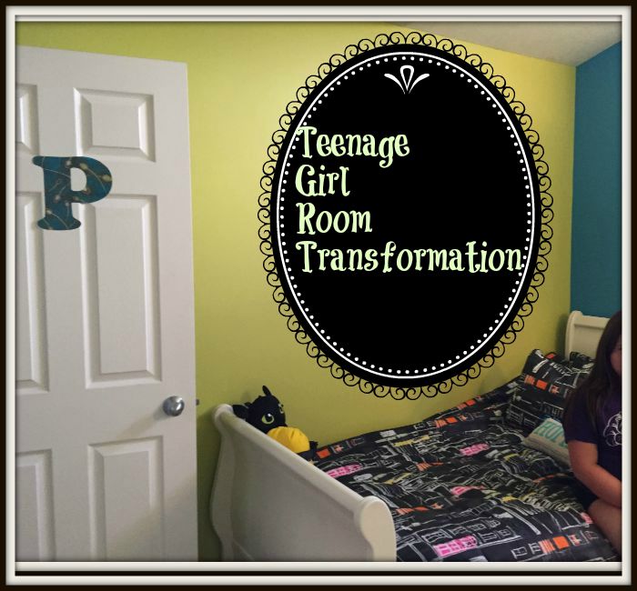
So I took the colour collections home and worked on my daughter and my husband and then we measured and agreed on some that would look great in her new space. My oldest girl Payton was about to start high school so it seemed like a great way for her to take ownership of her room as well. We decided we would start with her room. So this is the story in pictures of transforming a teenage girl room from drab to FAB and making it high school ready.
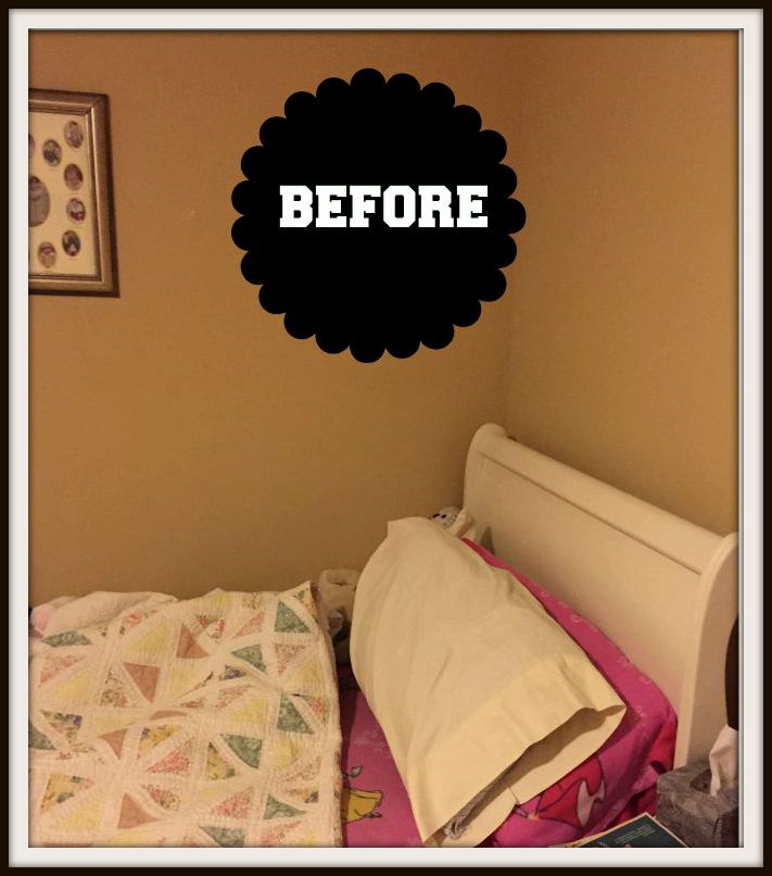
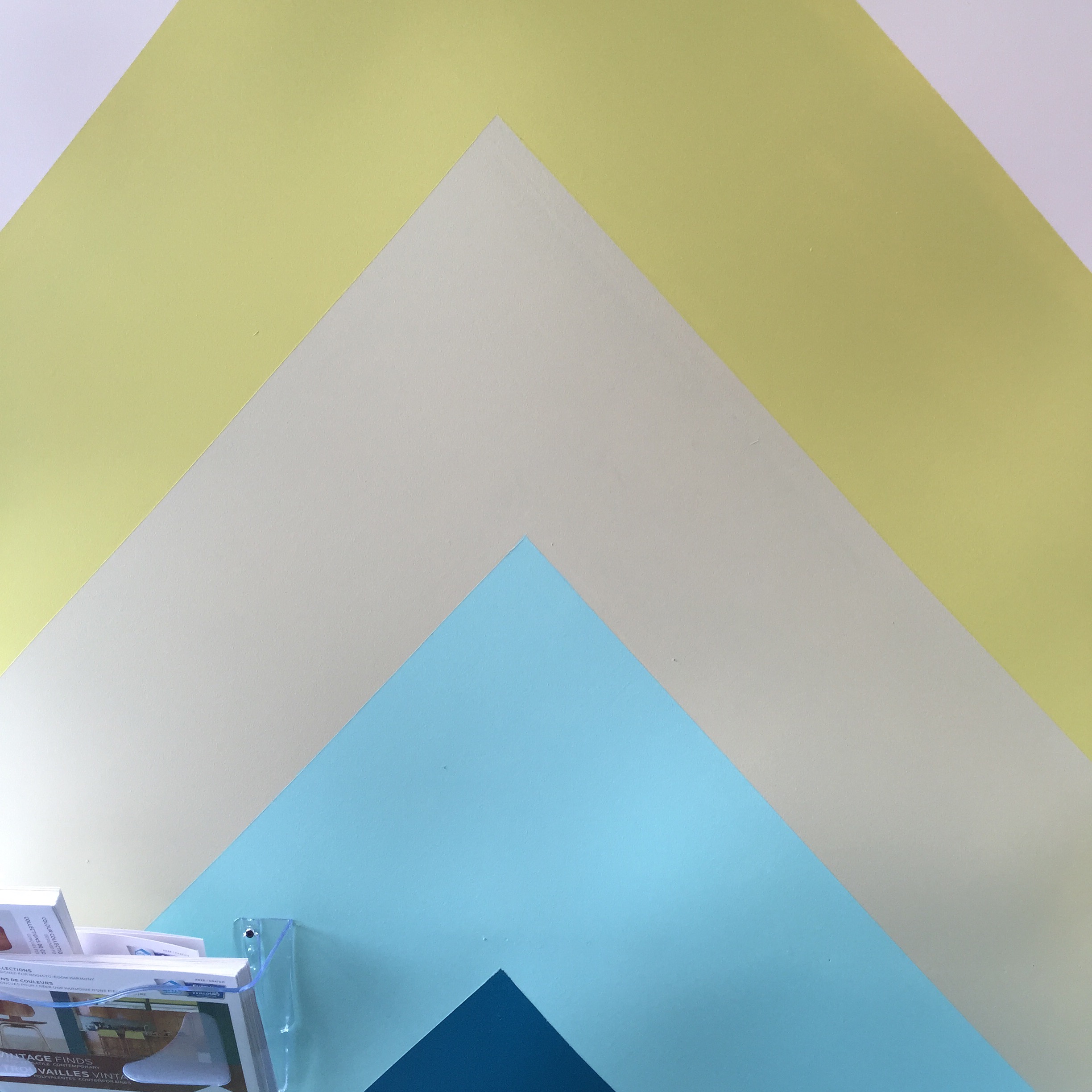
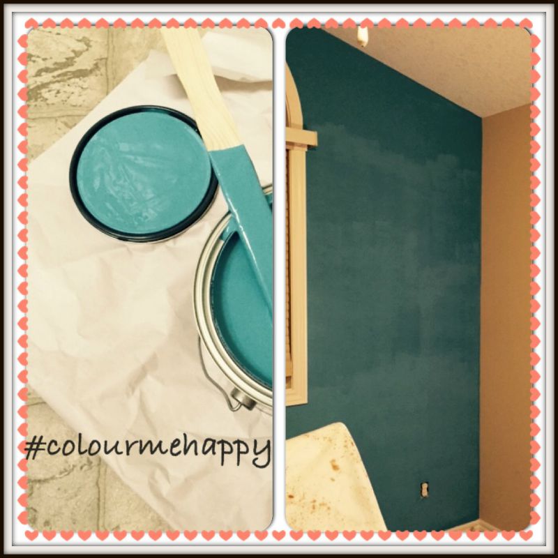
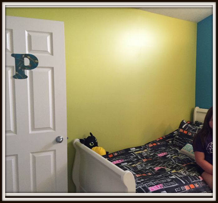
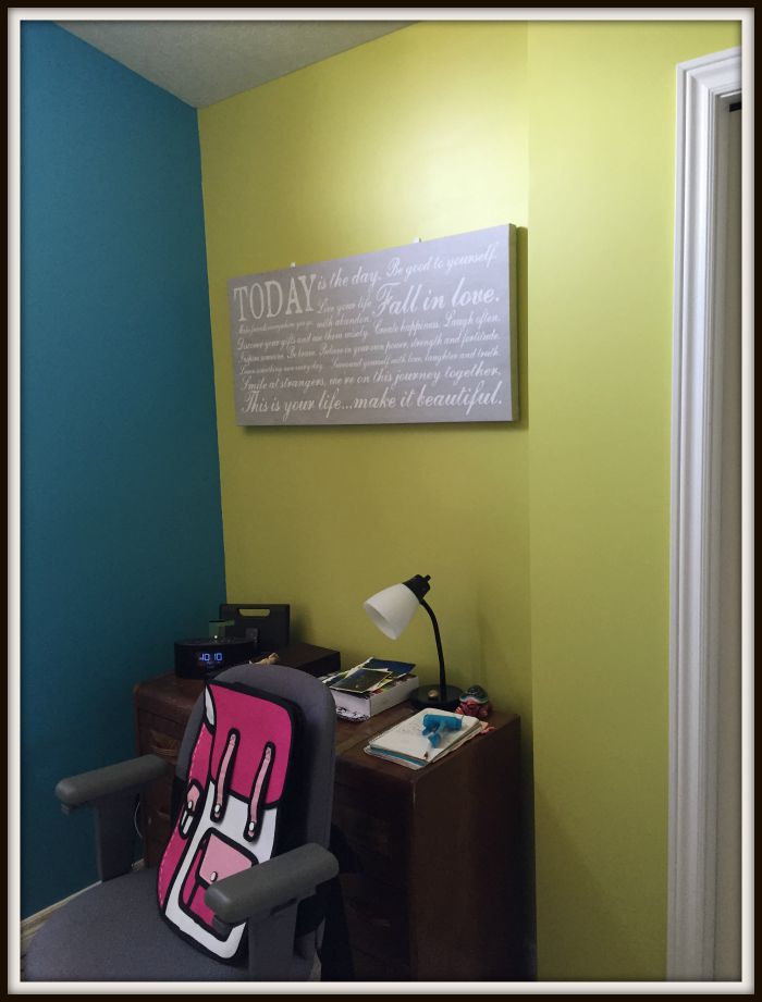
My husband and I took advantage of the week the girls were at camp this year to pull Payton’s room apart and transform it with colour. Together we chose, with Payton’s help – Capri, Frolic and Icicle. We strayed a bit from the original HGTV Home by Sherwin-Williams colour palette shown above, but we got the inspiration from those shades. The ceiling is high in Payton’s room and there is a lot of natural light, so we all figured it could carry a bit of colour. The brighter shades were chosen specifically for her because she needs cheery colours to help her with her outlook. Payton just turned 14. She struggles with anxiety, is very sensitive, creative and smart. So, she obviously had to have a huge say in what shades worked best for her as well. She loved the blue most of all. It is her favourite colour. We had been hunting for a blue before we discovered Capri. Capri is part of the Fashion Forward colour collection by Sherwin-Williams. The bold green is called Frolic. We used Capri on the accent wall (the wall that you see first when you walk in the room).
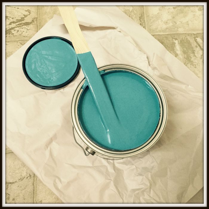
We (and by we I mean mostly my husband) painted the accent wall Capri first. His comment to me was that he was shocked by the coverage. The HGTV Home by Sherwin-Williams Capri shade transformed the accent wall in just one coat. I was surprised myself.
That was the first night. Capri dried beautifully and had no streaks and no odour that I could discern at all. HGTC Home by Sherwin-Williams interior acrylic latex paint formula features low VOC and has paint and primer in one, providing a durable and washable coating for use in all areas of the home. It comes in flat, eggshell, satin and semi-gloss finishes. We opted for eggshell finish. This paint comes with a lifetime limited warranty. I consulted my good friend Margarita to determine whether Frolic would work on one or two walls in Payton’s room and she felt that both side walls could carry Frolic nicely.
So Frolic went on next. That shade was a lot lighter and although we had a light paint colour on the wall beneath we needed two coats on each of the walls because there were some scratches from picture frames that had marked the wall beneath and they were showing through the one coat. So two coats it was. I had gone away to a meeting in Toronto when I returned to find both walls done. It was dramatic and I posted the results on Facebook the day I came back. I loved the look already.
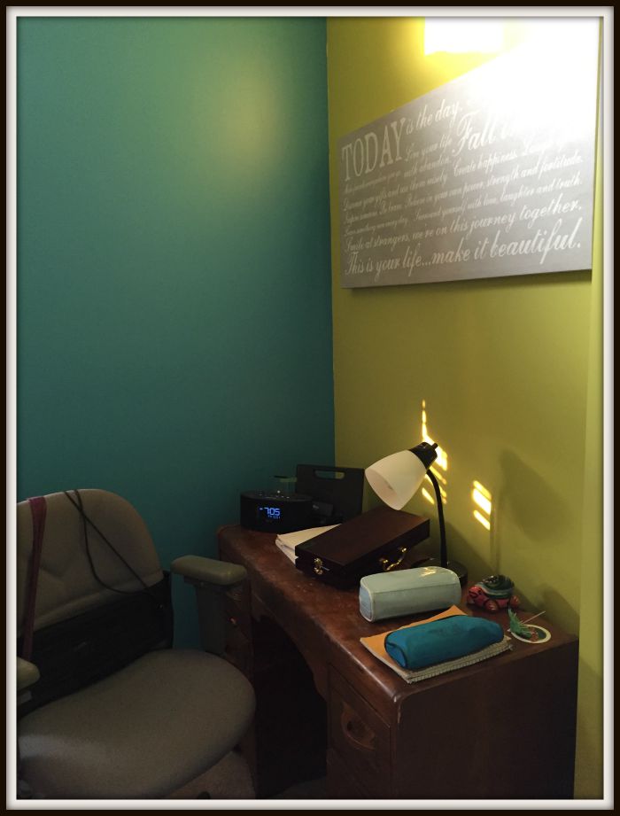
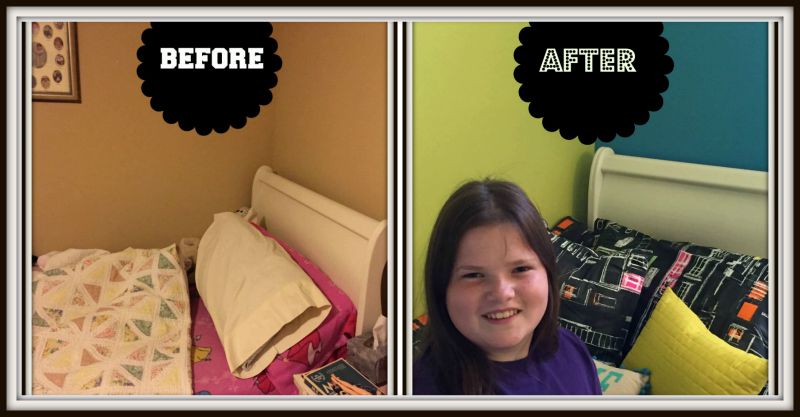
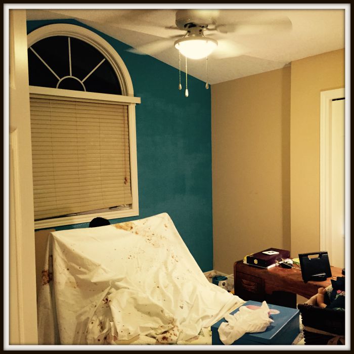
Looks so dramatically different! I love that. So does my daughter. The room needed one more wall shade. You can’t see much of it here. But Icicle went on the wall behind the dresser. We aren’t completely done the entire room transformation. But we found a mature bedding set at Homesense and scooped that up because the price was right and Payton liked it. I was originally thinking grey ruffled bedding. But I like the black pattern in here grounding the colours a bit for right now. Payton chose this one. Bedding can easily be switched out for other shades at a later date if we want to switch that.
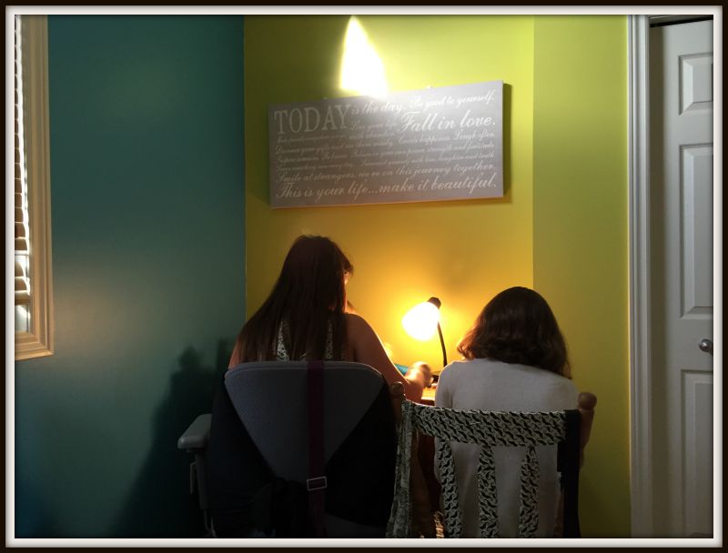
I found a motivational quote picture saying I loved one night when I was out shopping and I hung that over Payton’s desk. It’s a saying that reminds her to reach for the stars. “Today Is the Day. Be good to yourself. Make friends everywhere you go. Live your life with abandon. Fall in love. Discover your gifts and use them wisely. Create happiness. Laugh often. Inspire someone. Be brave. Believe in your own power, strength and fortitude. Learn something new everyday. Surround yourself with love, laughter and truth. Smile at strangers. We are on this journey together. This is your life …Make it Beautiful.”
Our work isn’t completely done here yet. I might replace the desk or the bookshelf. I still dream of a reading corner here too. The walls still need some more artwork or bookshelves. But the painting is done and we are more than happy. I think this is a room that helps to take a tween firmly into teenage high school mindset.

You might also be interested in the earlier post from this series: Painting a Room.
I think this experience has helped me to learn to embrace colours and make this house our own. Now if we could only agree on the shades for my younger daughter’s room. The basement will be our next project.
The paint I used HGTV HOME by Sherwin-Williams SHOWCASE (which is the highest quality they carry) is exclusively available at Lowe’s across Canada.
Thanks to Sherwin-Williams for sponsoring the paint that helped to make this room happen.


It came out awesome. I can see why she loves it.
Oh my goodness – I love it!! The colours are so fun and vibrant, perfect for a teen girl 🙂 I’m getting ready to paint my kid’s rooms soon and although they’re not teens yet, this gives me inspiration 🙂
Glad to help Brandi!! There are so many great combinations out there. I highly recommend Sherwin-Williams.
So nice! What a fun transformation! I find it so hard to visualize things like that, so it’s awesome that you could see how the combination would look before you committed to it@
EXactly!! That’s what I have trouble with too! I need the help so it worked out well that they had those colours all coordinated already.
Wow, I love the after! So bright and fun for teen girls.
The capri color is awesome! What a fun way to add life to your daughter’s room!
I also love that quote on the wall, the signage I mean.
I love the colors! Amazing how they completely transform the space!
It’s so colorful now. Paint does work wonders.
I love the colors in this room. It looks amazing. You did a great job.
Thanks so much Ann! We are not usually this colourful.
These paint colors and awesome and the shine looks perfect. The quote picture looks great on the wall too.
Those colors look fab on her walls! Very cool for a tween/teen room! Great job!
Love the blue colour. I need to get on planning my daughters room. I have had a few ideas, but need to spend some time working it all out.
I really LOVE the colors she picked! They make a big difference and brightens up the room.
I love that color. It is definitely a fun one for a teen!
It came out fantastic1 Good for you! I love to paint and recreate a room.
I love the different colors on the walls. I think it’s great and I love, love, love the ‘after!’
Is amazing how paint on the walls can transform a room! I love the bright fun colors!
Congratulations on the wonderful paint job for your daughter’s room! I love the contrast of colors and the quote on wall. You are indeed a supermom!
I love the transformation. The colors you chose are perfect and they made the room look brighter.
Wow I am loving the walls. The room looks fantastic. My girls would love walls like those! Especially the teal!
What an amazing change! I love the bright colours she went for! x
I love the color combination. It is such a vibrant, fun room now. A reading corner would be a great addition to the beautifully painted room!
I love these colors. I think Capri is my favorite but I love the way the colors compliment each other. I also love the gray and white quote on the wall and how the gray contrasts with the blue and yellow.